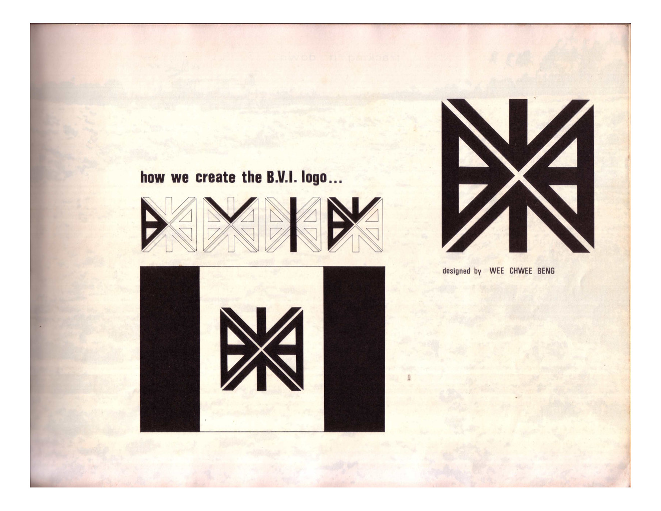
Baharuddin Vocational Institute
| Designer |
Wee Chwee Beng |
||||||||||
|---|---|---|---|---|---|---|---|---|---|---|---|
| Client |
Baharuddin Vocational Institute |
||||||||||
| Year |
1971 |
||||||||||

The school crest made up of the institution’s initials was designed by one of BVI’s pioneer teachers. Wee wanted a modern-looking badge that looked the same regardless which direction one looked at it when printed on a flag.
“I fought very hard for them to accept it. It must have consensus of the group so I was saying this would be modern and contemporary," he said. "Whereas if you start to have lions and tigers [animals symbolising Singapore and Malaysia respectively that are found on the state crest], you are going back. You should have a vision to look forward.”
| References |
|
||||||||||
|---|---|---|---|---|---|---|---|---|---|---|---|